Introduction to bokeh
Bokeh is an amazing tool for data visualization. If you are looking for a tool that makes your life easier with data visualization and gain you some praising for your work this is what you want.
Why Bokeh?
Bokeh is an interactive visualization library that targets modern web browsers for presentation. Its goal is to provide elegant, concise construction of versatile graphics, and to extend this capability with high-performance interactivity over very large or streaming datasets.
That definition can hold you for 2 minutes and force you to read it again, But the last line omitted above gives you peace and reading it you can proceed with satisfaction. Here it is :-
Bokeh can help anyone who would like to quickly and easily create interactive plots, dashboards, and data applications.
Installation
A quick installation guide along with all dependencies can be found here.
Basics of Bokeh
In this article we will only be dealing with all the basics and rest we will be learning on the fly. Steps for a basic plot :-
1. Make a figure
2. add glyphs.
3. show the plot in a output_file() or notebook.
Today we will be covering some basic plots . Given the list :-
1. Scatter plot.
2. Histograms.
3. line charts.
4. pie charts.
5. Hexbins.
6. area(stacked).
In addition we’ll be learning :-
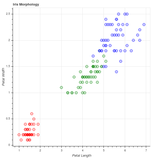
Styling.Scatter Plot
We’ll be using iris dataset for practice.Steps remain the same as specified above :-
#import plotting essentials
from bokeh.plotting import figure, show, output_file
#import the data required
from bokeh.sampledata.iris import flowers

#set each specie to different color
colormap = {'setosa':'red', 'versicolor':'green','virginica':'blue'}
colors = [colormap[x] for x in flowers['species']]

#put a figure instance
p = figure(title = 'Iris Morphology')
#styling
p.xaxis.axis_label = 'Petal Length'
p.yaxis.axis_label = 'Petal Width'

#adding glyphs
p.circle(flowers['petal_length'], flowers['petal_width'], color = colors, fill_alpha = 0.2, size =10)
#output plot into a file
output_file('iris.html', title = 'iris.py example')

#show plot
show(p)
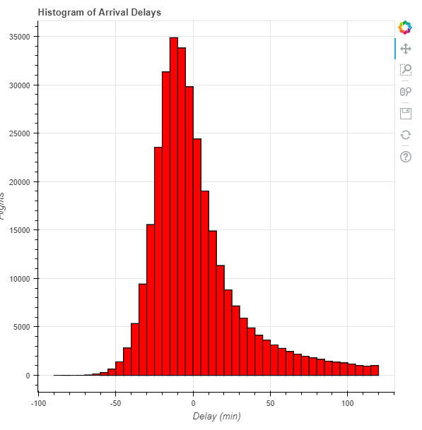
Histograms
bokeh does not have a function defined to plot histograms but can be made with some intelligence using quad.We’ll be using dataset
#loading the data
flights = pd.read_csv('flights.csv', index_col = 0)

#making bins of 5 minuntes and limit the delays to [-60, +120]minutes
arr_hist, edges = np.histogram(flights['arr_delay'], bins = int(180/5), range = [-60, 120])

delays = pd.DataFrame({'arr_delay':arr_hist, 'left':edges[:-1], 'right':edges[1:]})

p = figure(plot_height = 600, plot_width = 600, title = 'Histogram of Arrival Delays', x_axis_label = 'Delay (min)', y_axis_label = 'Number of Flights')

p.quad(bottom=0, top =delays['flights'], left = delays['left'], right = delays['right'], fill_color = 'red', line_color = 'black')

output_file('delay histogram plots.html')

show(p)
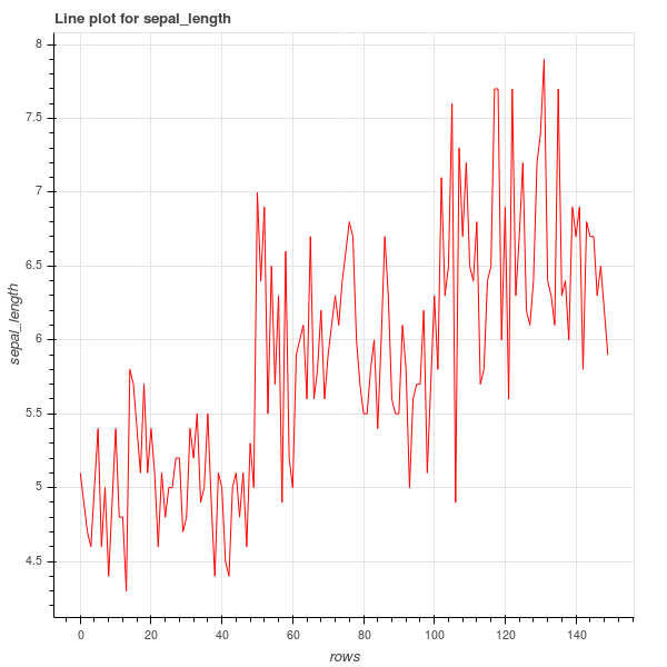
Line charts
Fortunetly, Bokeh has a line glyph and can be added easily.We’ll use iris dataset.
import pandas as pd
import numpy as np
#import plotting essentials
from bokeh.plotting import figure, show, output_file
#import the data required
from bokeh.sampledata.iris import flowers

y = flowers['sepal_length']
x = np.arange(0, len(y))

p = figure(plot_width = 600, plot_height = 600, title = "line plot on sepal_length", x_axis_label = "rows", y_axis_label = "sepal_length")

p.line(x, y, line_color = "red")

output_file("line_plot.html")

show(p)
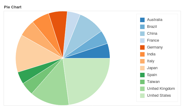
Pie Charts
In bokeh , one has to make pie plot with specifying angles for each sector and use wedge to draw it.
from math import pi

import pandas as pd

from bokeh.io import output_file, show
from bokeh.palettes import Category20c
from bokeh.plotting import figure
from bokeh.transform import cumsum

output_file("pie.html")

x = {
    'United States': 157,
    'United Kingdom': 93,
    'Japan': 89,
    'China': 63,
    'Germany': 44,
    'India': 42,
    'Italy': 40,
    'Australia': 35,
    'Brazil': 32,
    'France': 31,
    'Taiwan': 31,
    'Spain': 29
}

data = pd.Series(x).reset_index(name='value').rename(columns={'index':'country'})
data['angle'] = data['value']/data['value'].sum() * 2*pi
data['color'] = Category20c[len(x)]

p = figure(plot_height=350, title="Pie Chart", toolbar_location=None,
           tools="hover", tooltips="@country: @value", x_range=(-0.5, 1.0))

p.wedge(x=0, y=1, radius=0.4,
        start_angle=cumsum('angle', include_zero=True), end_angle=cumsum('angle'),
        line_color="white", fill_color='color', legend='country', source=data)

p.axis.axis_label=None
p.axis.visible=False
p.grid.grid_line_color = None

show(p)
If you tried it you can see if we point our arrow over the sectors it is showing some information .That’s how bokeh shows passive interactions.
Here the Hover magic came from the arguments:- tools = "hover", tooltips = "@country:@value" along with specifying the source of data source = data.
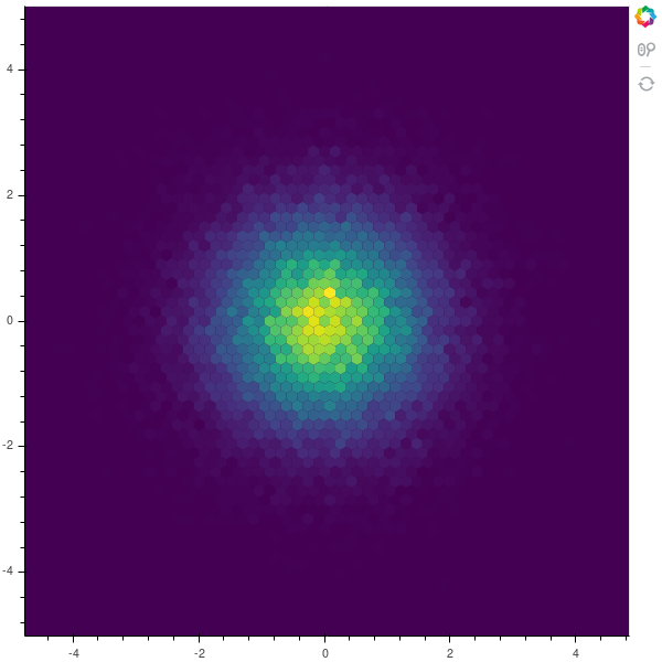
Hexbin
For hexbin we will use random variables to show a good plot.
from bokeh.palettes import Viridis256
from bokeh.util.hex import hexbin

#making random data
n = 50000
x = np.random.standard_normal(n)
y = np.random.standard_normal(n)

#make bins with the data here '0.1' is the size
bins = hexbin(x, y, 0.1)

# color map the bins by hand
color = [Viridis256[int(i)] for i in bins.counts/max(bins.counts)*255]

# match_aspect ensures neither dimension is squished, regardless of the plot size
p = figure(tools="wheel_zoom,reset", match_aspect=True, background_fill_color='#440154')
p.grid.visible = False

p.hex_tile(bins.q, bins.r, size=0.1, line_color=None, fill_color=color)

show(p)
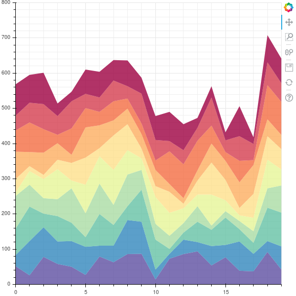
Area Stacked
Area plots are bit complex to make, we’ll be drawing area plots with patches . Most of the code down below is for making the data.
#importing necessary libraries
import numpy as np
import pandas as pd
from bokeh.plotting import figure, show, output_file
from bokeh.palettes import brewer

#intialization
N = 20
cats = 10
df = pd.DataFrame(np.random.randint(10, 100, size = (N, cats))).add_prefix('y')

#making data
df_top = df.cumsum(axis=1)
df_bottom = df_top.shift(axis = 1).fillna({'y0':0})[::-1]
df_stack = pd.concat([df_top, df_bottom], ignore_index  =True)

#choosing color palette
colors = brewer['Spectral'][df_stack.shape[1]]

#for x axis
x2 = np.hstack((df.index[::-1], df.index))

#putting our figure
p = figure(x_range = (0, N-1), y_range = (0, 800))
p.grid.minor_grid_line_color = '#eeeeee'

#adding glyphs
p.patches([x2] * df_stack.shape[1], [df_stack[c].values for c in df_stack], color = colors, alpha = 0.8, line_color = None)

#show the plot
output_file('example.html')

show(p)
Styling
Basic Styling of the plots include styling of :-
- Grid
- Tick labels
- Axis properties
- Glyphs
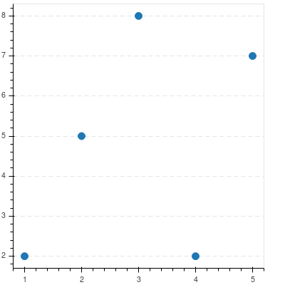
Starting with Grid
Grid can be customized using two main elements that are :-
grid
It is used for stying grid lines.
Here is a example with simple customization , Basic format remains the same just name of properties change.
from bokeh.io import output_notebook, show
from bokeh.plotting import figure

p = figure(plot_width = 400, plot_height = 400)
p.circle([1,2,3,4,5], [2,5,8,2,7], size = 10)

#Hide xgrid
p.xgrid.grid_line_color = None

#add transparency to ygrid and change line to dashed
p.ygrid.grid_line_alpha = 0.5
p.ygrid.grid_line_dash = [6, 4]

output_file('example.html')

show(p)
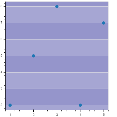
Band
Bands can be customized in a similar way.They are used to style space between grid lines.
from bokeh.io import output_notebook, show
from bokeh.plotting import figure

p = figure(plot_width = 400, plot_height = 400)
p.circle([1,2,3,4,5], [2,5,8,2,7], size = 10)

#Hide xgrid
p.xgrid.grid_line_color = None

#add transparency to band of ygrid and fill color
p.ygrid.band_fill_alpha = 0.1
p.ygrid.band_fill_color = 'navy'

output_file('example.html')

show(p)
Tick Labels
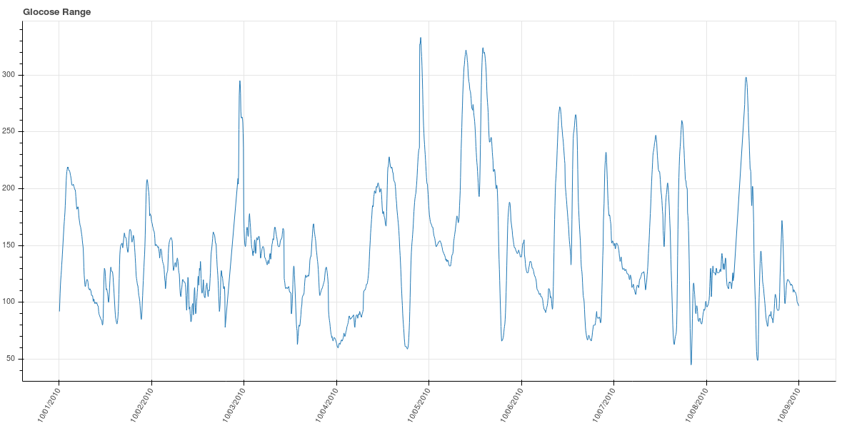
Bokeh Axes have a formatter property which can configure tick formatters for numeric, datetime or categorical axes. Here is a example:-
#imports
from bokeh.io import output_notebook, show
from bokeh.plotting import figure
from math import pi
from bokeh.sampledata.glucose import data
#extracting subset
week = data.loc['2010-10-01':'2010-10-08']
#configuring the figure
p = figure(x_axis_type = "datetime", title = "Glucose Range", plot_height = 350, plot_width = 800)
#format the date on xaxis display type
p.xaxis[0].formatter.days = "%m/%d/%Y"
#rotate the xaxis labels to 60'
p.xaxis.major_label_orientation = pi/3
#draw glyphs
p.line(week.index, week.glucose)

#show plot
output_file('example.html')

show(p)
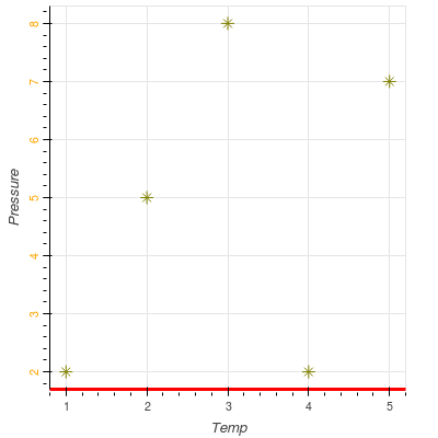
Axis Properties
We can format one of three with this i.e. xaxis, yaxis, axis
from bokeh.io import output_notebook, show
from bokeh.plotting import figure
p = figure(plot_width=400, plot_height=400)
p.asterisk([1,2,3,4,5], [2,5,8,2,7], size=12, color="olive")

# change just some things about the x-axes
p.xaxis.axis_label = "Temp"
p.xaxis.axis_line_width = 3
p.xaxis.axis_line_color = "red"

# change just some things about the y-axes
p.yaxis.axis_label = "Pressure"
p.yaxis.major_label_text_color = "orange"
p.yaxis.major_label_orientation = "vertical"

# change things on all axes
p.axis.minor_tick_in = -3
p.axis.minor_tick_out = 6

show(p)
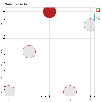
Glyphs
Glyphs can be styled with their arguments specifying size, fill_alpha, fill_color etc and their properties before and after selection. Here is an example :-
#imports
from bokeh.io import output_notebook, show
from bokeh.plotting import figure
from bokeh.models.markers import Circle
#add figure with tools = 'tap'
p = figure(plot_width = 400, plot_height = 400, tools ="tap")

#draw circles as glyphs
r =  p.circle([1,2,3,4,5],[2,5,8,2,7], size = 50, fill_alpha = 0.2, line_color = "firebrick", line_dash = [5, 1], line_width = 2)

#add selection styling
r.selection_glyph = Circle(fill_alpha =1, fill_color = "firebrick", line_color = None)
#add nonselection styling
r.nonselection_glyph = Circle(fill_alpha=0.2, fill_color = "grey", line_color = None)

#show the plot
output_file('example.html')
show(p)
Conclusion
We studied basics of bokeh plotting. I truly enjoy making plots in bokeh.
Note:- many of the examples above are taken from official bokeh documentation