Geomapping with Python
Plotting in python is fun and challenging. Self explanatory plots are a visual aid to data science. In a mess of Data(I love it!) describing your audience what exploration you did on data is itself a task that a Data Scientist must fullfill, It gets even worse when the data is describing something on the map such as population of a area, Flights etc.
Brief
In Python it is easy to plot these as their are a lot of libraries but when it comes to which is more convincing everyone has a differing choice. Today i will introduce you to Geomap plotting in Python with various libraries specifically :-
1. Matplotlib

2. Bokeh

3. Plotly
Comparison is upon you but yes i will surely tell my favourite!
Note :- We will be using
california house pricingdata which can be found here.
Matplotlib
One common type of visualization in data science is that of geographic data. Matplotlib’s main tool for this type of visualization is the Basemap toolkit, which is one of several Matplotlib toolkits which lives under the mpl_toolkits namespace.
Installation
If you are on conda:-
conda install basemapor on Ubuntu :-
sudo apt-get install python-matplotlib
sudo apt-get install python-mpltoolkits.basemap
Plot
Now, we are ready for launch. So, hold tight and read the code below. Comments are provided but if you don’t get it it will be explained after this:-
#import essential libraries.
import numpy as np
import matplotlib.pyplot as plt
from mpl_toolkits.basemap import Basemap
import pandas as pd

#Hope you have downloaded the data. Read it with pandas
df = pd.read_csv('housing.csv')

#initiate the figure with it's size
fig = plt.figure(figsize = (8, 8))

#initialize the Basemap with appropriate arguments. These will be discussed later.
m = Basemap(projection = 'lcc', resolution='f', lat_0 = 37.5, lon_0 = -119,width=1E6, height=1.2E6)
m.bluemarble()
m.drawmapboundary()
m.drawrivers()
m.drawcoastlines()
m.drawcountries()
m.drawstates()

# Scatter plot with latitude and longitude values customizing color with median_house_value and median_income
m.scatter(df['longitude'].values,
		  df['latitude'].values,
		  latlon = True,
		  c = df.median_house_value.tolist(),
		  s = (10 * np.array(df.median_income.astype(int))),
		  cmap = 'viridis',
		  edgecolors = 'none')

#put a colorbar
plt.colorbar()

#save and show
plt.savefig('matplotlib_plot.png')
plt.show()
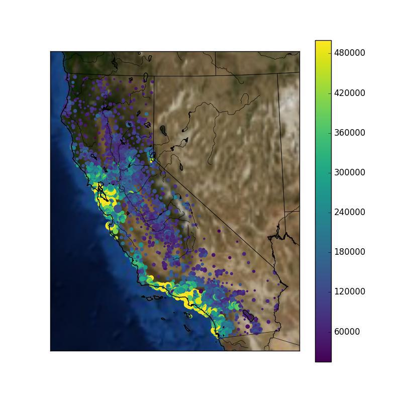
I think most of the code is self explanatory . So i will focus only on the Basemap. arguments :-
Projection :- There are a dozen of projection i.e when we trace curved surface of earth on 2-D plane it distorts the dimensions, These dimension can vary in each projection to a litle. You may have a different favourite then mine. available options are projections.
Resolution :- Here we have options such as
l, c, i, h, fcorresponding tolow, coarse, intermediate, high, fullwhich describes the amount of detailing required.lat_0 and long_0 :- these describe center of desired map domain(degrees).
width and height :- these describe width and height of desired map domain projection(metres).
Properties :- All other properties are required to show specific information on map. These are also a few which can be found here.
Basemap has an awesome documentation, all the links above will guide you to documentation.
Bokeh
Bokeh can help anyone who would like to quickly and easily create interactive plots, dashboards, and data applications.
Installation
If you are on conda:-
conda install bokehor on Ubuntu :-
pip install bokehPlot
Bokeh enables you with interactive plots and much more. They are beautiful and easy to write. Here we will be using mercator projection so firstly we have to preprocess our data(latitude and longitude) into mercator projections.
#necessary imports
from bokeh.plotting import figure, show, output_file
from bokeh.tile_providers import CARTODBPOSITRON
import pandas as pd
import numpy as np
import math
from ast import literal_eval
from bokeh.palettes import Viridis5
from bokeh.models import ColumnDataSource,ColorBar,BasicTicker
from bokeh.models.mappers import ColorMapper, LinearColorMapper

#function to convert latitude and longitude into mercator projection mapping
def merc(Coords):
	Coordinates = literal_eval(Coords)
	lat = Coordinates[0]
	lon = Coordinates[1]
	r_major = 6378137.000
	x = r_major * math.radians(lon)
	scale = x/lon
	y = 180.0/math.pi * math.log(math.tan(math.pi/4.0 + lat * (math.pi/180.0)/2.0)) * scale
	return (x, y)

#supporting function
def make_tuple_str(x, y):
	t = (x, y)
	return str(t)

#read with pandas
df = pd.read_csv('housing.csv')

#converting latitude and longitudes of corners of california into mercator range
range0 = merc('(32.080577, -114.052642)')
range1 = merc('(42.356802, -124.753326)')
x_range = (range0[0],range1[0])
y_range = (range0[1], range1[1])

#now convert DataFrame longitude and latitude column into mercator coordinates
df['coords'] = df.apply(lambda x: make_tuple_str(x['latitude'], x['longitude']), axis = 1)
df['coords_latitude'] = df['coords'].apply(lambda x: merc(x)[0])
df['coords_longitude'] = df['coords'].apply(lambda x: merc(x)[1])

#prepare data
source = ColumnDataSource(
	data = dict(
		lat = df['coords_latitude'].tolist(),
		lon = df['coords_longitude'].tolist(),
		size = df.median_income.tolist(),
		color = df.median_house_value.tolist()
		)
	)

#initiate figure
p = figure(x_range = x_range, y_range = y_range, x_axis_type = "mercator", y_axis_type = "mercator")
p.add_tile(CARTODBPOSITRON)

#color palette
color_mapper = LinearColorMapper(palette = Viridis5)

#add a glyph
p.circle(x = 'lat', y = 'lon',
		size = 'size',
		color = {'field':'color',
				 'transform':color_mapper},
		source = source
		)
#put a colorbar to support
color_bar = ColorBar(color_mapper=color_mapper, ticker=BasicTicker(),
                     label_standoff=12, border_line_color=None, location=(0,0))

#layout
p.add_layout(color_bar, 'right')

#show it in web browser
output_file('example.html')

show(p)
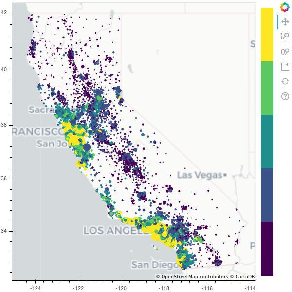
Explaining some code :-
merc :- This function takes a string of latitude and longitude into it’s argument following which evaluates it into floating values then putting into it’s local variables calculates mercator x, y with some maths.
make_tuple_str :- this function converts data longitude and latitude into tuple and then into a string.
source :- Bokeh makes it to shape data into dictionary for which it has defined a function
ColumnDataSource.figure :- initiate the figure with
x_rangeandy_rangealong withaxis_type. Then adding tile , Tile is a background attribute similar to matplotlibbluemarbelabove. More on tiles can be found here.color_mapper :- Color Palette.
circle :- this is glyph in bokeh. In this we also specify it’s size, location, color which will change with the data.
color_bar :- making a ColorBar and adding to the layout at right side.
The plot is beautiful and customized further with some garnishing. For more refer the documentation.
Plotly
My Favourite
Plotly’s Python graphing library makes interactive, publication-quality graphs online. Examples of how to make line plots, scatter plots, area charts, bar charts, error bars, box plots, histograms, heatmaps, subplots, multiple-axes, polar charts, and bubble charts.
Installation
On ubuntu :-
pip install plotlyPlotly is updated very often so you must do :-
pip install plotly --upgradePlot
#imports
from plotly.offline import plot
import pandas as pd

#read data
df = pd.read_csv('housing.csv')

#make a data dictionary
data = [dict(
			type = 'scattergeo',
			lon = df['longitude'],
			lat = df['latitude'],
			mode = 'markers',
			marker = dict(
			size = df['median_income'],
			symbol = 'circle',
			line = dict(
						width=1,
						color='rgba(102, 102, 102)'
						),
			colorscale = 'Viridis',
			cmin = 0,
			color = df['median_house_value'],
			cmax = df['median_house_value'].max(),
			colorbar=dict(
						title="Median House Value"
						)

        ))]

#define the layout
layout = dict(
			title = 'California House pricing',
			geo = dict(
        			resolution = 50,
        			scope = 'usa',
					showland = True,
					landcolor = "rgb(250, 250, 250)",
					subunitcolor = "rgb(217, 217, 217)",
					countrycolor = "rgb(217, 217, 217)",
					countrywidth = 0.5,
					subunitwidth = 0.5,
					center = dict(
								lon = -121.0,
								lat = 35.0
								),
					projection = dict(
								scale = 0.4
								),
					lonaxis = dict(
								 range= [ -127.0, -114.0 ]
								 ),
					lataxis = dict(
								 range= [ 35.0, 38.0 ]
								 ),
					),
			)
#add data and layout to figure
fig = dict(
		data=data,
		layout=layout
		)
#plot
plot(fig)
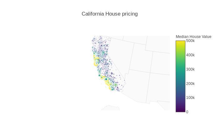
Code Explanation:-
data :- In data we specify a dictionary with key and value pairs. such as :-
type - type of plot,lon - longitude from data,lat - latitude from data,size - median income,color - median house value.layout :- dictionary of figure attributes. mainly
title - string,geo - dictionary of projection, resoltuion, details, center and axis.fig :- adding data and layout into one dictionary. So to provide plotly for rendering plot.
Plotly is amazing mainly for a clean code and it’s interactions. I personally like plotly. For more on plotly follow documentation.
Conclusion
Today we compared Geomapping with Plotly, Bokeh and Matplotlib(Basemap). In Future we may get more apealing libraries but for now this is the best we got.